Fastr Design Lab: Helping You Build Your Perfect Ecommerce Experience


The Fastr Team represents the collective expertise behind the Fastr Workspace — the AI-native platform built to unify insight and execution for enterprise commerce teams. Fastr combines AI-driven optimization (Optimize) with AI-native frontend execution (Frontend), giving teams the clarity to identify revenue opportunities and the speed to activate them without developer bottlenecks or replatforming. Through platform innovation and strategic services, Fastr helps multi-brand commerce organizations convert more from existing traffic, reduce tech bloat, and scale high-performing digital experiences.
This month, Zmags hosted the first in our new monthly virtual series, Fastr Design Lab. The program aims to build community amongst designers and ecommerce leaders, and share trends and best practices. Designs presented during the session were built with Fastr Frontend, the first Frontend-as-a-service built for business users, which helps businesses build unique, dynamic and interactive ecommerce experiences that distinguish both their brand and their individual products.
Over forty-five minutes, Zmags’ Director of Design Services Alex Spiret showcased a range of examples of homepages, product listing pages (PLP), and product detail pages (PDP), highlighting the benefits of each choice made by the retailer.
We encourage you to watch the entire conversation here as it includes step-by-step instructions for replicating some of the designs, but we’ll also provide you with a few of our favorite insights and takeaways in this recap blog.
Homepage design tips
Despite incoming traffic being dispersed to product and category pages with greater frequency, your homepage is still an important component of your ecommerce site—it reflects who you are as a business and what you can offer that customer that they might not find elsewhere. As such, you want to prioritize both ease of use and a design strategy that showcases your character and tells your story.
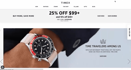
 Going through a number of examples, Alex pointed out what distinguished various homepages and how that spoke to both the brand and the ecommerce experience provided. For instance, while luxury watch retailer Timex took a clean, minimalist approach that put large images showing the fine details of their product at the fore, Toys R’ Us employed bright colors and wavy lines that almost resembled a child’s painting. One highlights luxury and professionalism, while the other projects fun.
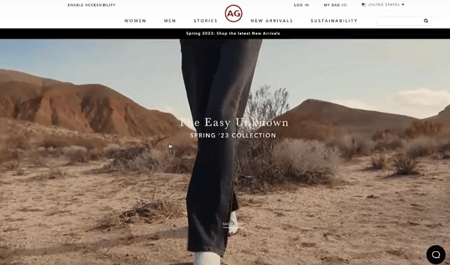
 AG Jeans uses a video on autoplay (and mute) in the background of its homepage hero, adding movement and immediately drawing visitors into the site. Movement isn’t just for visual interest— it can help draw the eye down the page to encourage scrolling and exploration. Ethan Allen achieves a similar effect by adding movement to still photos - shifting them a certain amount of pixels in one direction. This is part of a carousel that automatically changes when the movement concludes, ensuring that if a user is still on the same part of the page, that they continue browsing even without taking action.
This kind of interactivity on the page keeps customers engaged. If you have a lot of content to share, but don’t want to present a wall of words, you can use text carousels over images or background video. Carousels can have many styles - click through, scroll through, auto advance, and more. But, homepage interactivity isn’t limited to shopping carousels or brand content. Toys R’ Us includes a trivia question - answering correctly unlocks the path to shopping for the related product.
Navigational best practices
After establishing your brand, the next most important job of your homepage is to intuitively guide visitors to the products that you’re highlighting. Adding hotspots to allow even the most striking homepage photography to be shoppable ensures you keep buyers moving through the process.
Imagine you have a picture of a bedroom set—a hotspot could appear over each individual item and, if paired with quickviews and instant add to cart functionality, allow the user to select multiple products from the same image. Many sites use a standard “plus icon” to indicate hotspots, but the design of these hotspots is up to you. It can be more informative like a price tag or branded with a company-specific image.
Showcasing your products
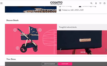
 When your customers do navigate through to a product listing or product detail page, it’s essential that they immediately get the sense of what makes the product(s) special. One brand, Cosatto, provided a video of a 360-degree view of a stroller, while another item allowed users to click on individual parts of the stroller to get a closer look and more information about functionality and design. For these products, Cosatto also included information on inspirations, making the product seem less like an item to be bought and more like a work of craft.
Another cool example came from the fashion company Hush, which allowed customers to build an outfit item by item, based on what they were looking at. More than a recommendation of “if you like x, you might also like y,” this feature provided the experience of going shopping and trying on your new look in front of that full length mirror.
Join the conversation
Fastr Design Lab is a monthly series, so if you’re looking for inspiration, instructions for implementing the latest design trends on your ecommerce site with Fastr Frontend, or just want to connect with other designers and step away from your day-to-day for an hour, join us for our next session on June 22nd.
